
Note: This post is based on one of the projects I did during my tenure at Metro Transit. You can find a copy of a BitBucket repository containing functions used in this post here.
Disclaimer: Opinions and comments expressed are solely my own and do not express the views or opinions of Metro Transit.
Within the past couple decades, many transit agencies across North America and all over the world have started to collect location records of every bus using the Automatic Vehicle Location (AVL) technology. This technology allows buses to generate their locations for as frequent as every few seconds. With this new source of data, new ways of visualizing and understanding bus speed need to be adopted.
During my time at Metro Transit, I had the great opportunity to work closely with these data. We designed a Shiny application that directly connects to the databases so that users can pull the data and visualize them all in one place. However, this post is not about the Shiny application. I would like to show a few of the visualizations Metro Transit uses to monitor its bus speed.
1 Data
In this example, Metro Transit route 2 data are utilized. Route 2 is a high-frequency bus route serving Minneapolis and the University of Minnesota. After defining the street segment of interest, along Franklin Ave, below is the plot of the raw location records around the street segment.
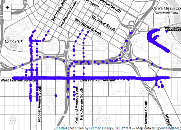
Figure 1: Route 2 raw location records
As you can see in Figure 1, the locations are pretty messy. To calculate bus speed along Franklin Ave, we only want to keep good records that are on Franklin Ave. To do this, we drop all location records that are more than a specified distance away from the street segment of interest. In this example, we only keep records that are within 20 meters from Franklin Ave.
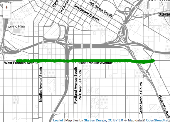
Figure 2: Cleaned location records
2 Speed Calculation
Now that we have a clean dataset to work with, we can start doing our speed calculation. For any two consecutive locations on a trip, we can calculate the average speed the bus traveled between them. We, then, calculate the average speed for each location from all the trips.
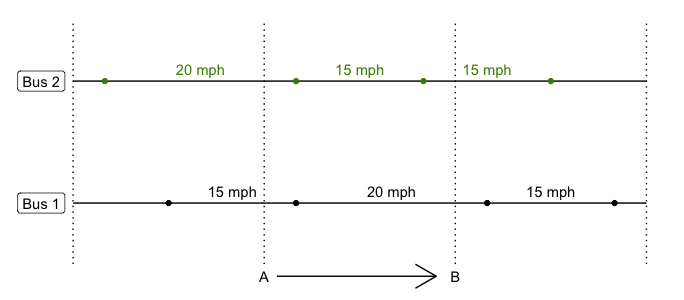
Figure 3: Speed estimation
For example, in Figure 3, estimated bus speed traveling from A to B would be:
\[speed_{AB} = average(20, 15, 15, 15, 20) = 17 \text{mph}\]
The first three speeds are from Bus 1 because the AB segment overlaps those three speeds, and two for Bus 2. This method is not perfect because each speed is weighted equally regardless of how much they contribute to the segment. However, in practice, we set our segment to be one meter and the speed is averaged across many trips, so that would not be a big issue.
3 Speed Visualization
There are many ways you can visualize bus speed, be it on a map or a line plot. Below are a few examples.
3.1 Speed along route line
leaflet package in R provides an easy, yet flexible, way for interactive mapping. Figure 4 below shows average speed for Metro Transit Route 2 at every meter along the street segment of interest on Franklin Ave. The speeds shown are average across three weekdays, traveling eastbound. If you hover over any point along the line, it will show the estimated speed. Each blue marker on the map represents route 2 bus stops, and each red cross icon represents signalized intersections.
Figure 4: Speed along route line
From this map, we can easily see that buses slow down as it reaches their stops or hitting a red light at a signalized intersection.
3.2 Grid Heatmap
Plotting speed on a map makes it very easy to identify the locations of low or high speed. However, when one needs to compare speeds across time of day or day of week, it is not practical to plot many maps. A grid heatmap, although takes away the spatial aspect of the visualization, provides a way to easily compare across time of day or day of week. In Figure 5 below, you can see Metro Transit route 2 speed along the Franklin Ave segment for every hour between 6 am and 8 pm. On the Y-axis, we have bus stop identifiers.
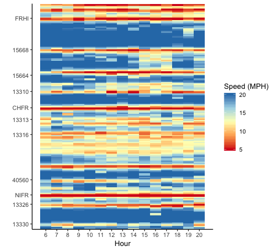
Figure 5: Grid Heatmap by Hour
With this visualization, patterns start to emerge. For example, buses slow down between stops 15668 and 13310 between 3 pm and 5 pm more than any other time throughout the day.
3.3 Speed by Distance Plot
In transportation planning, sometimes knowing the average speed is not enough. On-time performance is crucial to the operations, but reliability is also just as important. Range of speed can be used as a proxy for reliability. Larger variance of speed can be interpreted as less reliable. Figure 6 below shows a speed by distance plot of Metro Transit route 2 speed, with 80% confidence interval. Black dotted lines show where bus stops are, and red dashed lines show where traffic signals are. From this plot, not only can we check whether speed varies along the route, but also how variable it is at any location.
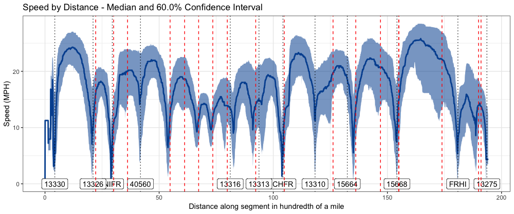
Figure 6: Speed by Distance
3.4 Spaghetti Plot
With each of the three plots above, it is very difficult, if not impossible, to detect an anamoly. With a speghetti plot (see Figure 7), individual trip is plotted. We have distance along the street segment on the X-axis, and cumulative time on the Y-axis. So, if there are any bad trips that may affect aggregated speed values, they can be easily spotted. In this plot, a vertical line means that the bus stopped at that location for a period of time, and a flatter line means the bus traveled faster along that segment.
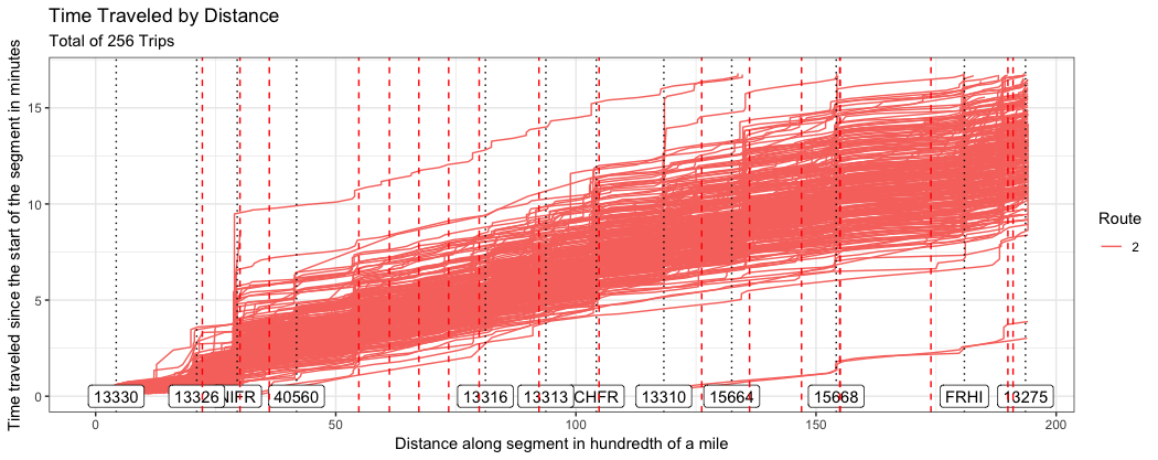
Figure 7: Spaghetti Plot
4 Wrapping Up
I like these plots because although their data source is the same, they tell different aspects of a story. When putting together, the story is more complete. However, this is by no means an exhaustive list of ways to visualize bus speed.